By: Nick Gibson / @euro_adventures
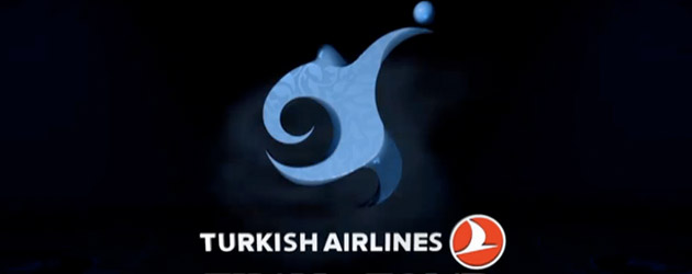
With three teams in the Top 16—Anadolu Efes, Fenerbahce Ulker and Galatasaray—and a league sponsor with the word ‘Turkish’ in it, Istanbul is plenty ready to host this Final Four. And with the Top 16 draw set, Jordi Bertomeu thought it appropriate to unveil the F4’s logo. Take a look-see.
Whereas last year’s Barcelona logo was inspired by Antonio Gaudi’s tendency to spin the color wheel, Istanbul’s rendition also pays homage to their city’s landmarks. This from the Euroleague:
The logo is inspired by the geographic location of the city, its graphic identity, and the art and culture of the country. The design focuses on two special concepts, the water and the undulating shapes of two of the most important buildings in Istanbul, the Blue Mosque and Hagia Sophia, merged with basketball.
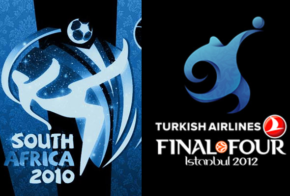
She’s a beauty, that Final Four logo. And while that basketball rolls off our undulating pal’s fingers, it sure looks like that leg is winding up to kick the living daylights out of something. A soccer ball, maybe.
Thinly veiled conspiracy? Probably not. Soccer (or football) doesn’t own the concept of running while handling a sphere. All in all, this logo keeps it classy.
But just for fun…
 Posts
Posts

